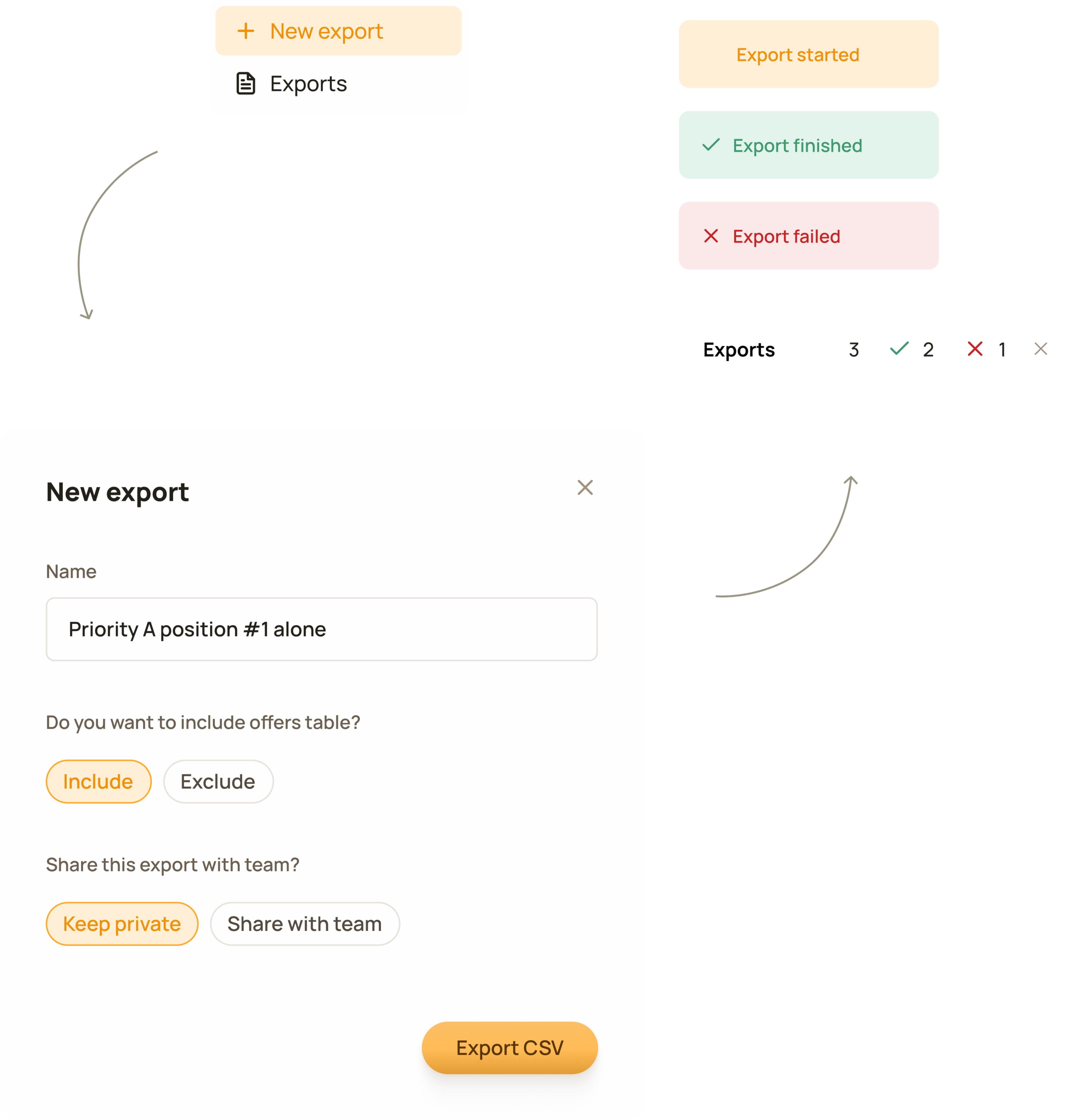
Export is a widely used feature. Exports can take time to process. To help, we allow users to run multiple exports at once and track their progress easily.
B2B / SaaS / Web App
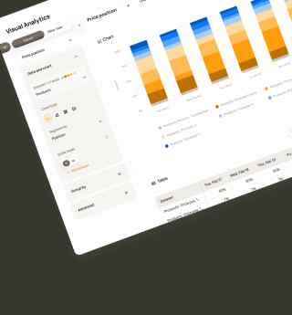
Priceindx
A new dynamic data table. All primary actions are placed on the right side, while global filters sit on the left and remain visible across the entire tool.
Export is a widely used feature. Exports can take time to process. To help, we allow users to run multiple exports at once and track their progress easily.
When I joined the company as its first designer, the data presentation tools were outdated and rigid. The list view was the first to be replaced with a new, more flexible solution.
Priceindx was founded in 2006 in Sweden and was the first company in its field in Europe. Gathering and processing large amounts of competitor data has been at the core of the service Priceindx has provided to retailers and brands ever since. Customers access this data through data presentation and data visualisation tools on the web platform.
The existing tool was rigid and outdated, and it didn’t allow us to include all customer product data and the necessary functionality.
The general problem was already understood across the organisation. The need had surfaced repeatedly over a long time through discussions with customers, support tickets, and input from stakeholders.
I discovered that in many cases, users accessed the table from other parts of the product, where they wanted to identify products underperforming on specific metrics.
I brought this information together and, to deepen my understanding and better define the problem, I gathered additional insights from stakeholders closest to the customers, as well as from internal usage data. My focus was on understanding end-user workflows and the context of use.
Ideation focused on forming a scalable solution by defining requirements, mapping data, exploring concepts, and eventually conducting domain research to establish the solution architecture, behaviour, and interaction patterns before moving into detailed design.
It quickly became clear that we needed something structurally more robust and powerful than a simple product list view.
We understood that there was significantly more data than initially expected. This was largely due to the inclusion of dynamic pricing, the product’s core feature, which fundamentally changed the scope.
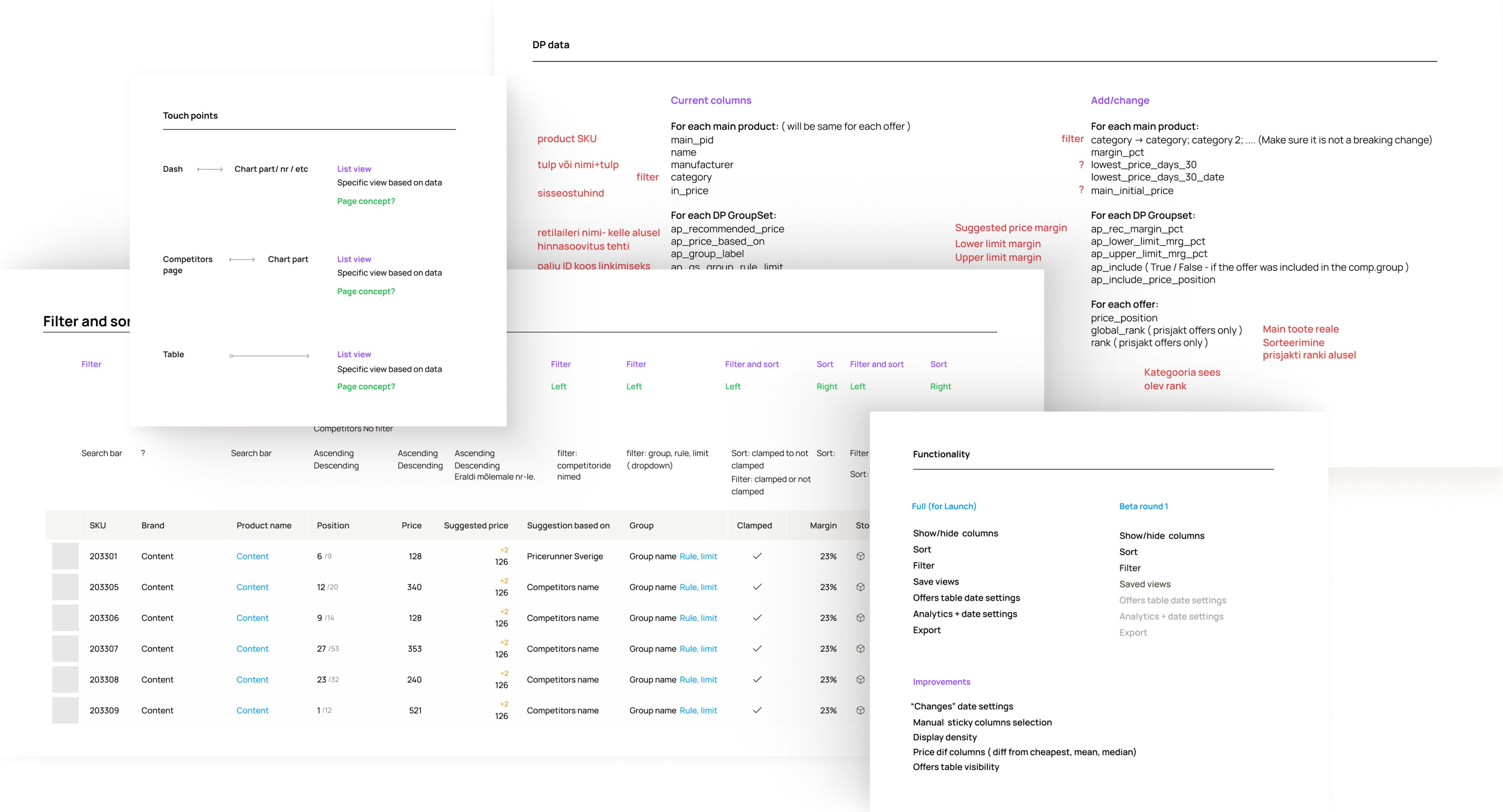
Some examples of documentation from ideation and execution phases.
Early sketches of the table
We decided to build a dynamic data table that includes all product information and necessary functionality, is accessible from anywhere in the product, and can handle growing amounts of data.
This part was all about handling constraints and challenges. Performance limitations and data complexity required critical decisions around filtering, loading, and navigation to ensure the table remained usable with large datasets.
We decided to design the feature around our largest customer’s database. If it worked for them, it worked for (almost) everyone.
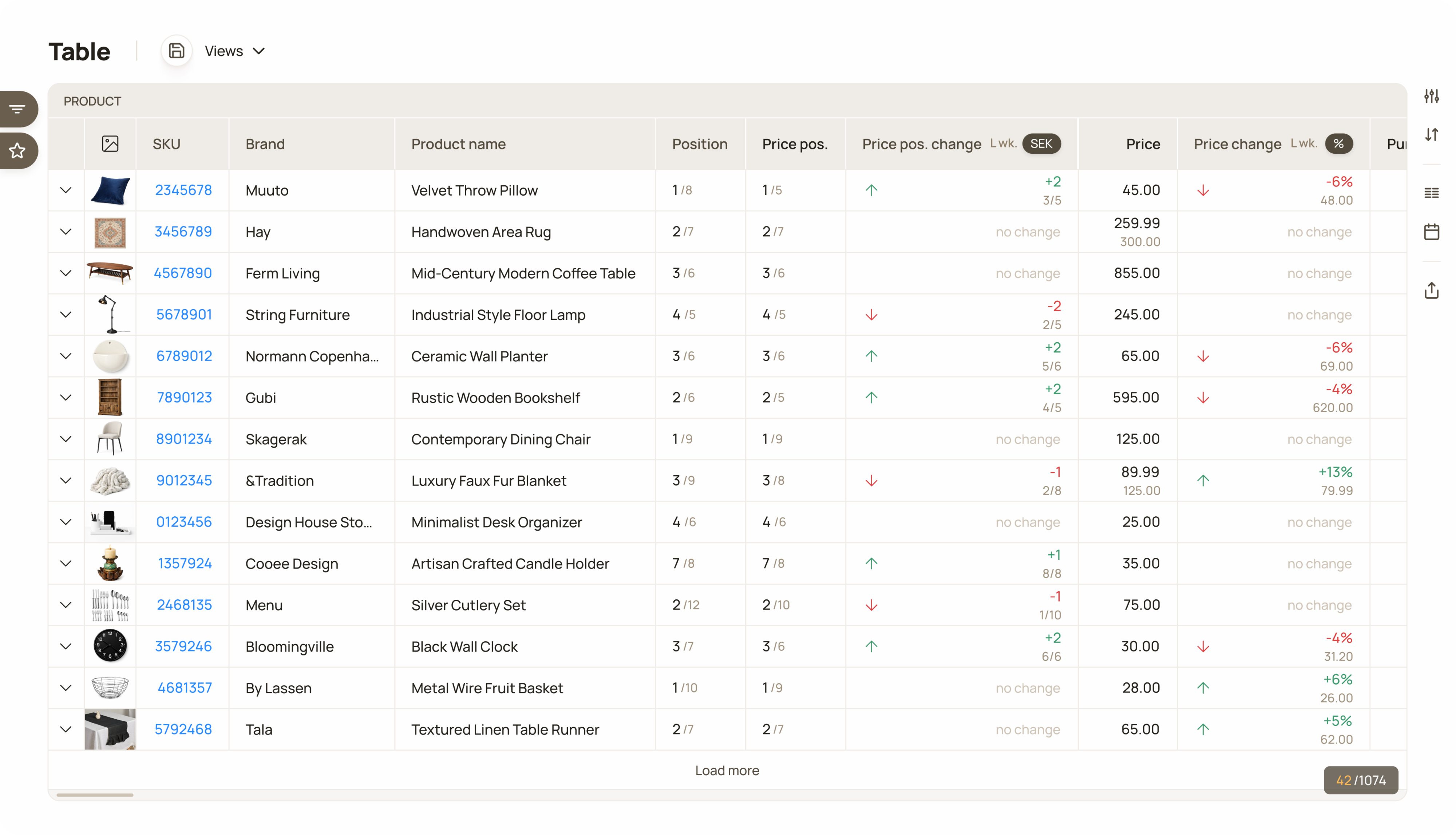
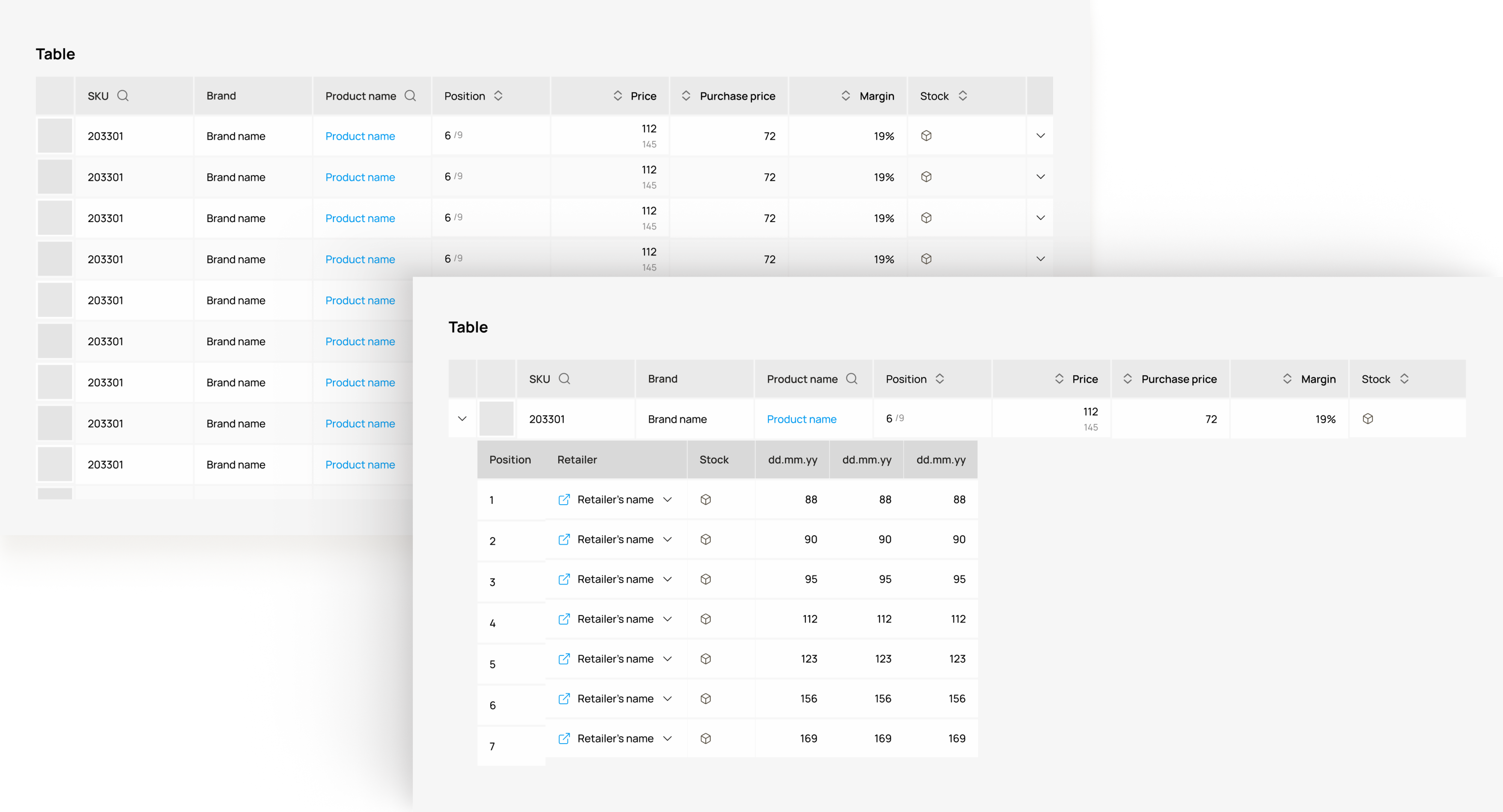
This approach helped surface pain points early on. The number of product attributes was very high, which meant the table ended up with more than 60 columns. I divided the data into sections and allowed users to choose which sections and columns they wanted to see at any given moment.
An average laptop screen fits about 10 columns, while even the smallest customers had far more than that. On top of that, each table row included an inline table. I created a scrolling behaviour that ensured a smooth, easy-to-navigate experience.
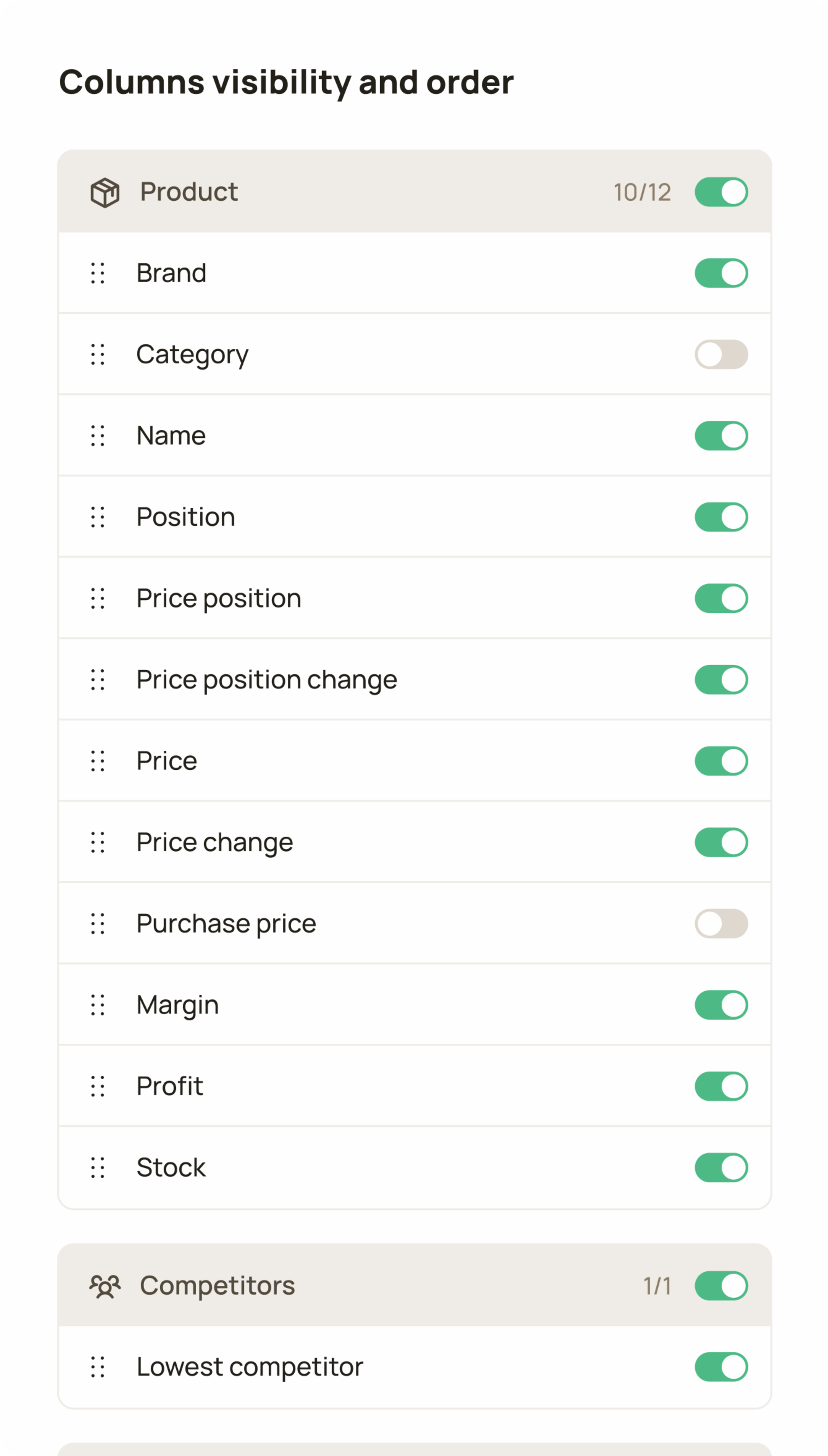
Users can fully customize column visibility and order. However, core attributes remain fixed to ensure the table always remains usable.
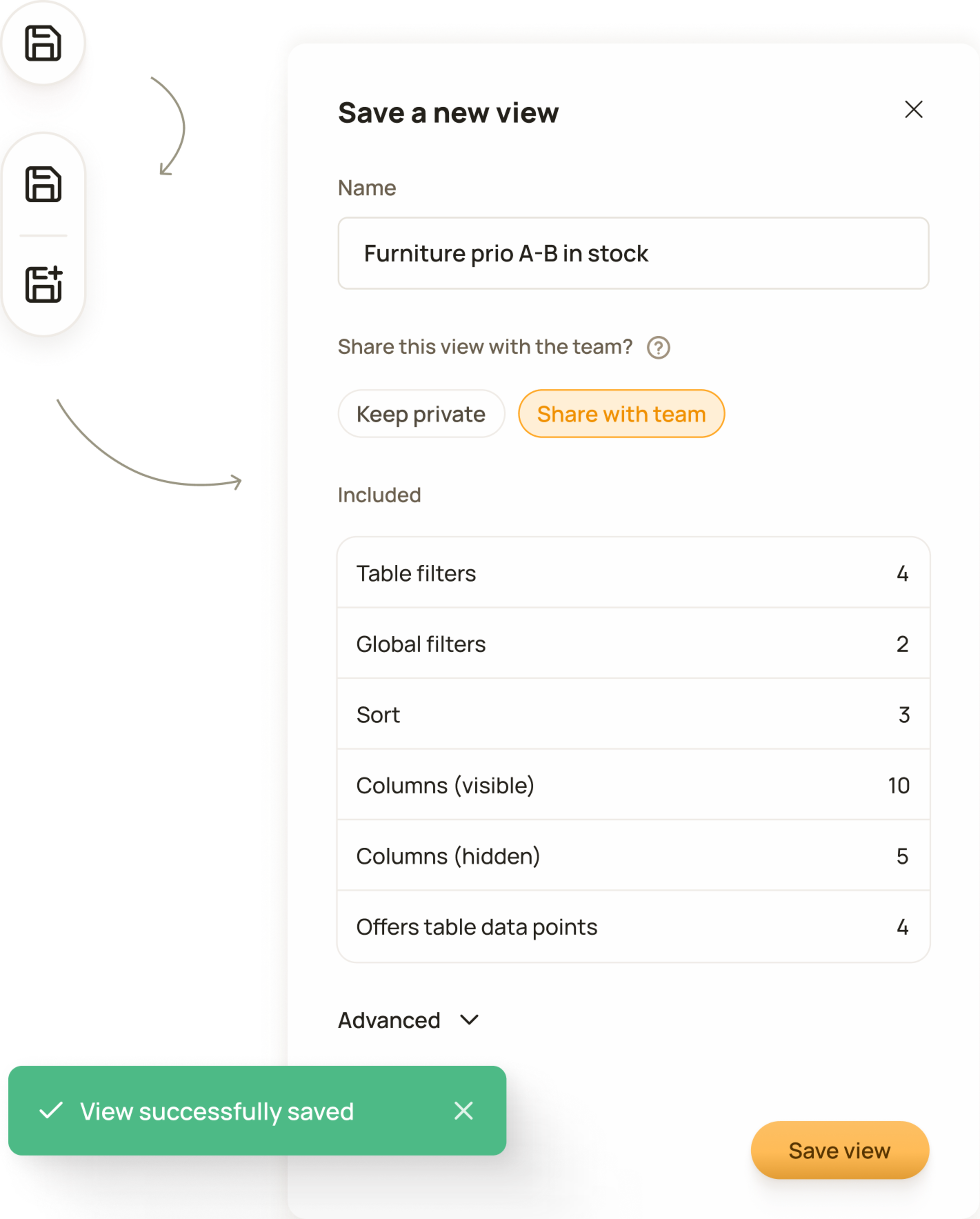
Designed for daily product management workflows. Users can configure a table view once and save it for quick, repeated access.
I chose batch filtering instead of per-filter fetching. Per-filter fetching would have triggered a request on every interaction, significantly increasing load times.
The biggest constraint was the underlying system infrastructure, which directly affected table performance. Because of that, I chose batch filtering instead of per-filter fetching. This, in turn, affected how filters were positioned: instead of inline (per column), we went with a separate filter dialog.
Another decision driven by this constraint was choosing user-initiated incremental loading instead of infinite scroll. Requesting all the data from the backend at once would have meant much longer loading times.
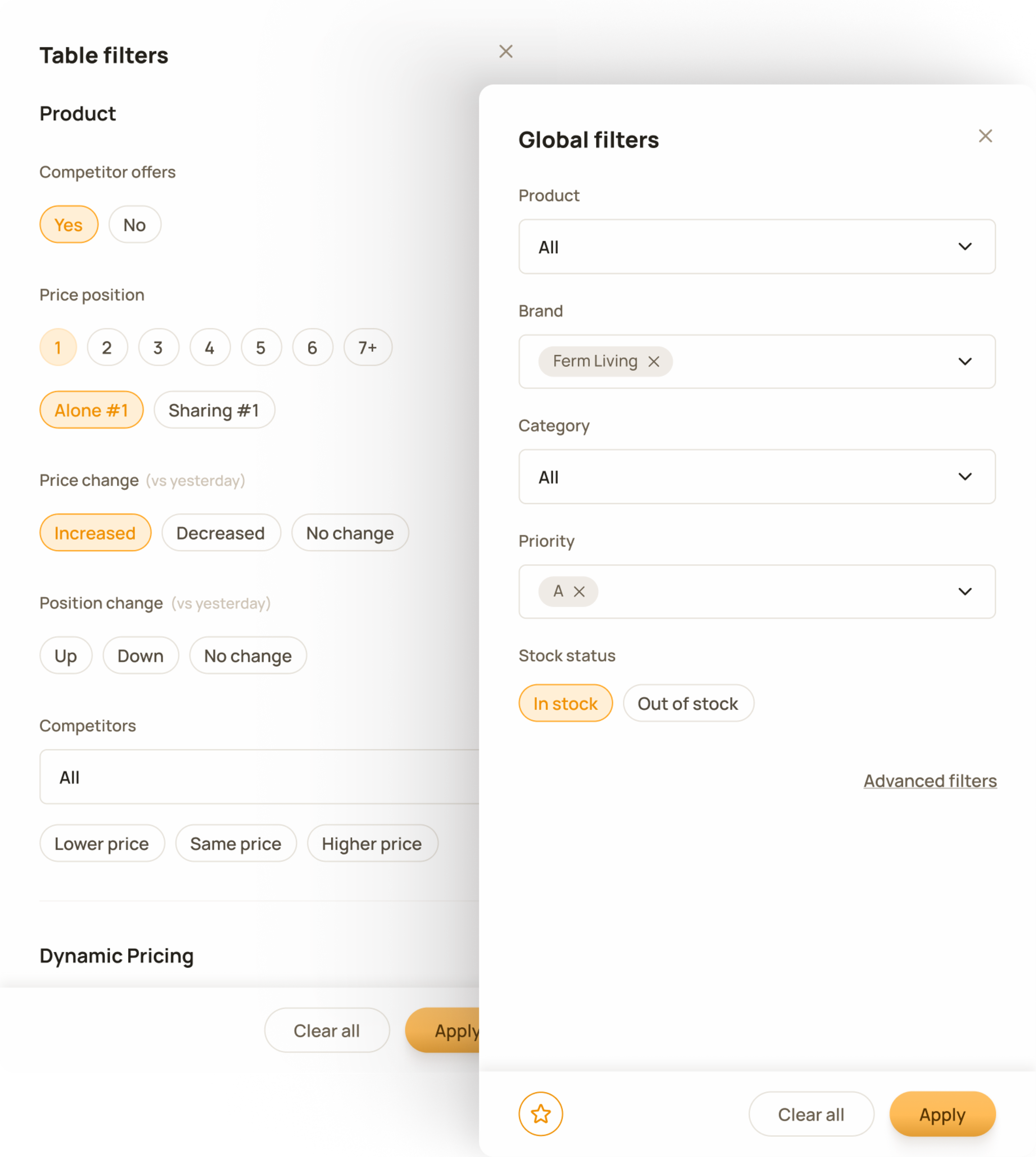
Global filters operate at product level. Selections made in one tool persist across the product, ensuring a continuous workflow.
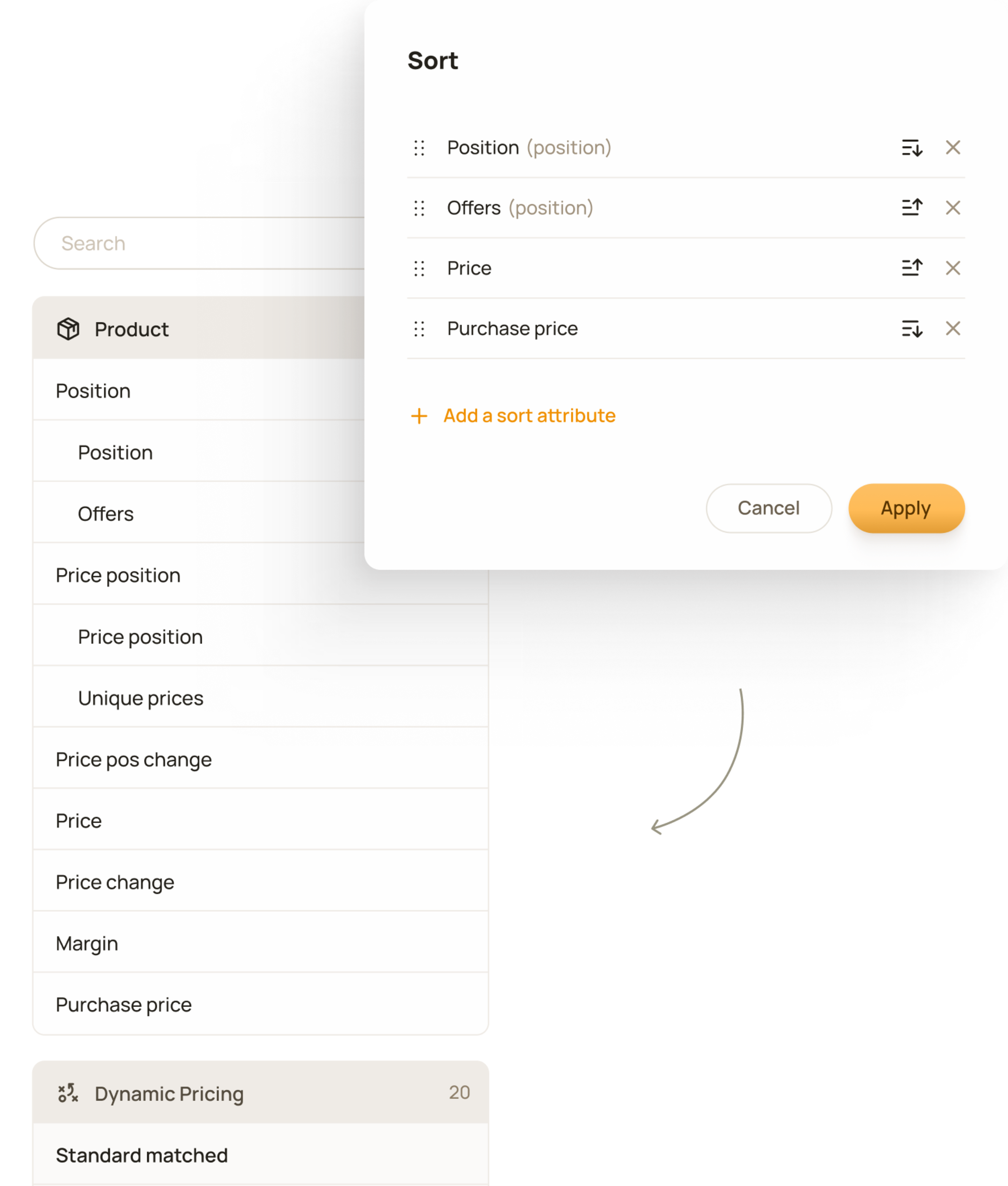
Users can sort by any quantitative value in the table, add multiple sorting criteria, and define their priority.
For testing, I chose an unmoderated testing approach with a group of six customers, including enterprise clients, for whom we released the beta version for approximately five days and gathered feedback through an online survey.
Feedback revealed a need for extra functionality, with export being the most requested feature, which had been planned already but was not included in the beta version.
We wanted customers use the tool in their natural work environment with their actual data, helping reduce bias and better reflect real-world usage to ensure realistic and meaningful feedback, which we achieved. Feedback revealed some blind spots that we had missed.
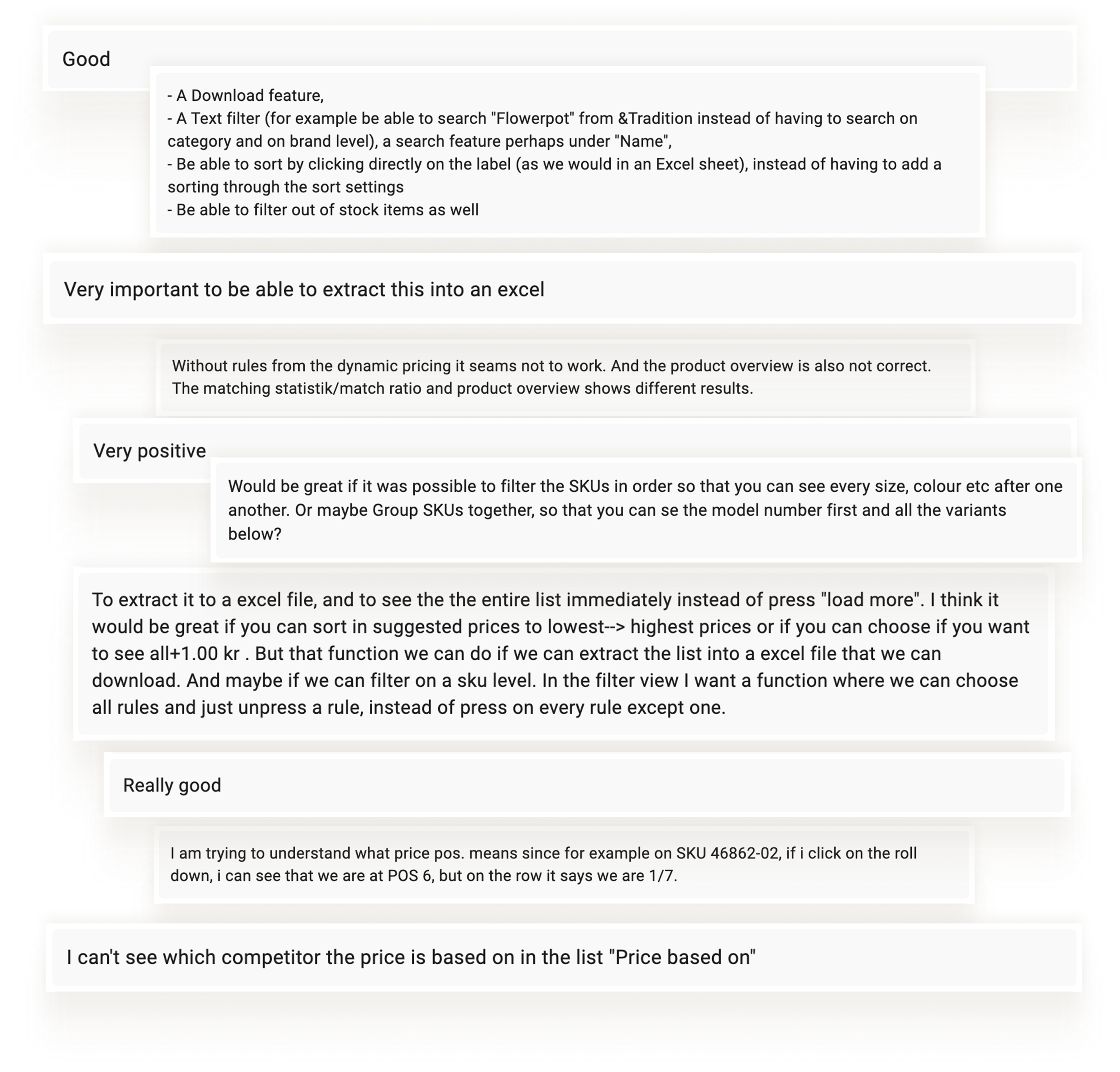
Raw customer feedback showed deep engagement with the table, exactly what we aimed for with unmoderated testing using real customer data.
In addition to iterations on the core functionality, pre-launch stakeholder discussions revealed the need for dedicated user guidance. Its purpose was to reduce incoming questions and provide additional help when interacting with the feature, particularly for new users.
An interactive tutorial that introduces the core functionality through short video clips, brief text descriptions, and by highlighting where features are located.
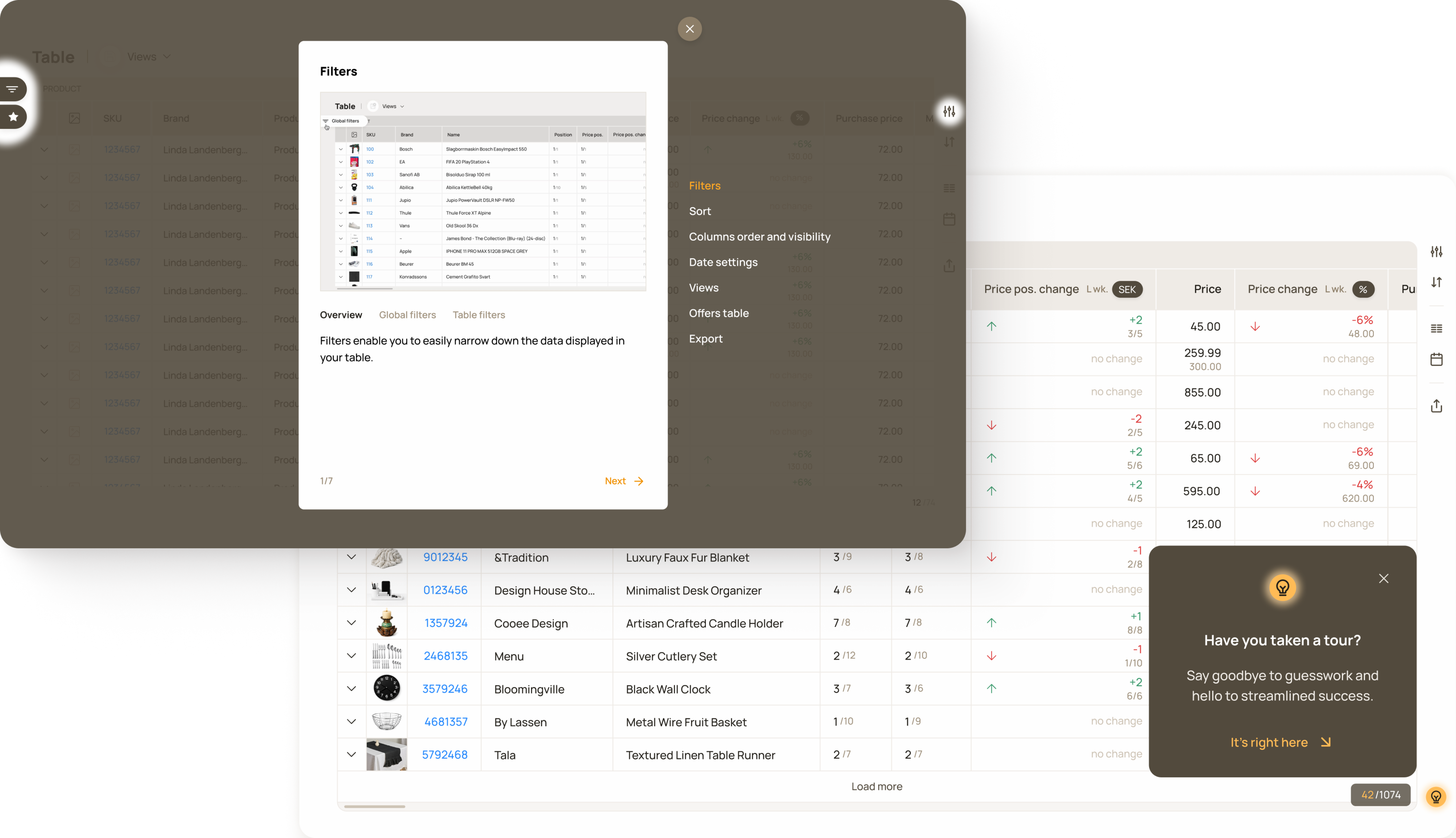
When a user interacts with the table for the first time, a pop-up appears in the bottom-right corner that encourages them to take the tour.
Adoption after launch was fast. Internal metrics showed strong usage early on, which was also reflected in customer feedback. Beyond the feature itself, its release improved overall satisfaction with the product.
4000+
Data exports generated
“Very positive.”
Customer quote
“Really good.”
Customer quote
120+
Custom workflows created
One customer invested in an ultra-wide monitor to see the entire table at once.
Customer feedback
Customers: 80+. Metrics have been anonymised, rounded and presented without a time frame to protect company confidentiality.
Product Strategy Officer
Product Owner
Engineers
Designer
As the sole designer I was responsible for the full design cycle, from conceptualisation to polished UI. I was working closely with the product, customer success and engineering to shape the solution within real technical and business constraints.