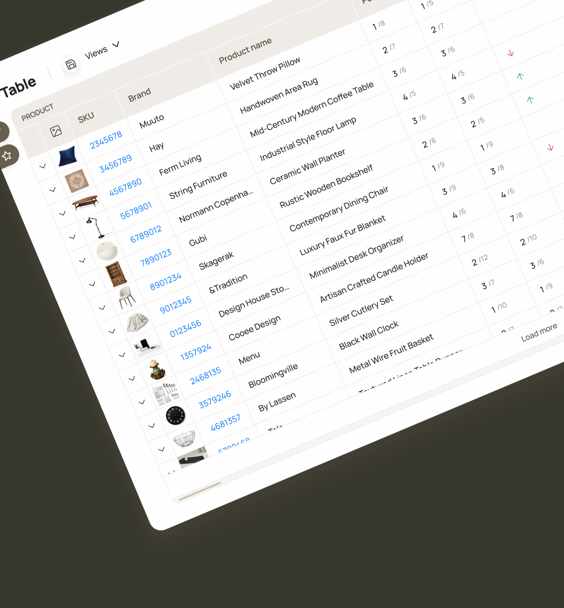
Filters allow users to generate reports for specific brands, categories, or products based on selected attributes.
B2B / SaaS / Web App
Priceindx
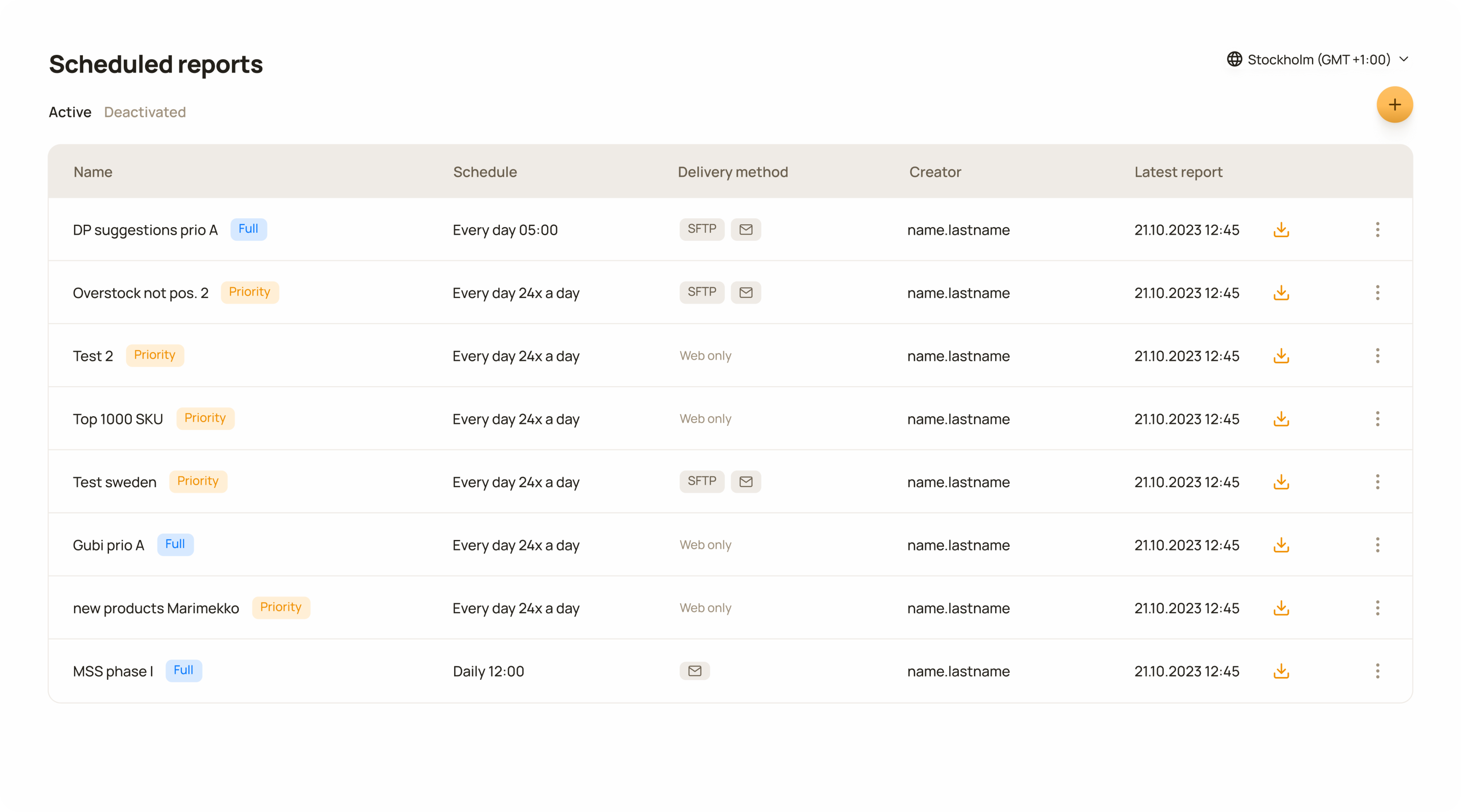
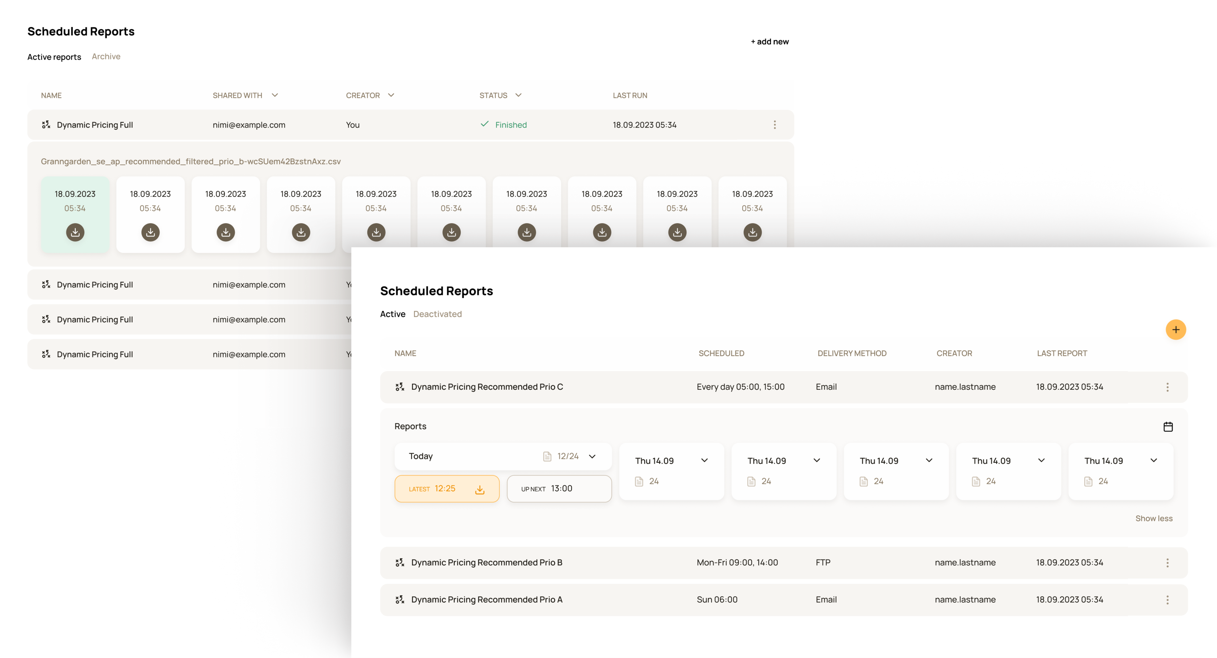
Each row represents an automated report workflow that is configured once and then runs daily according to the defined schedule.
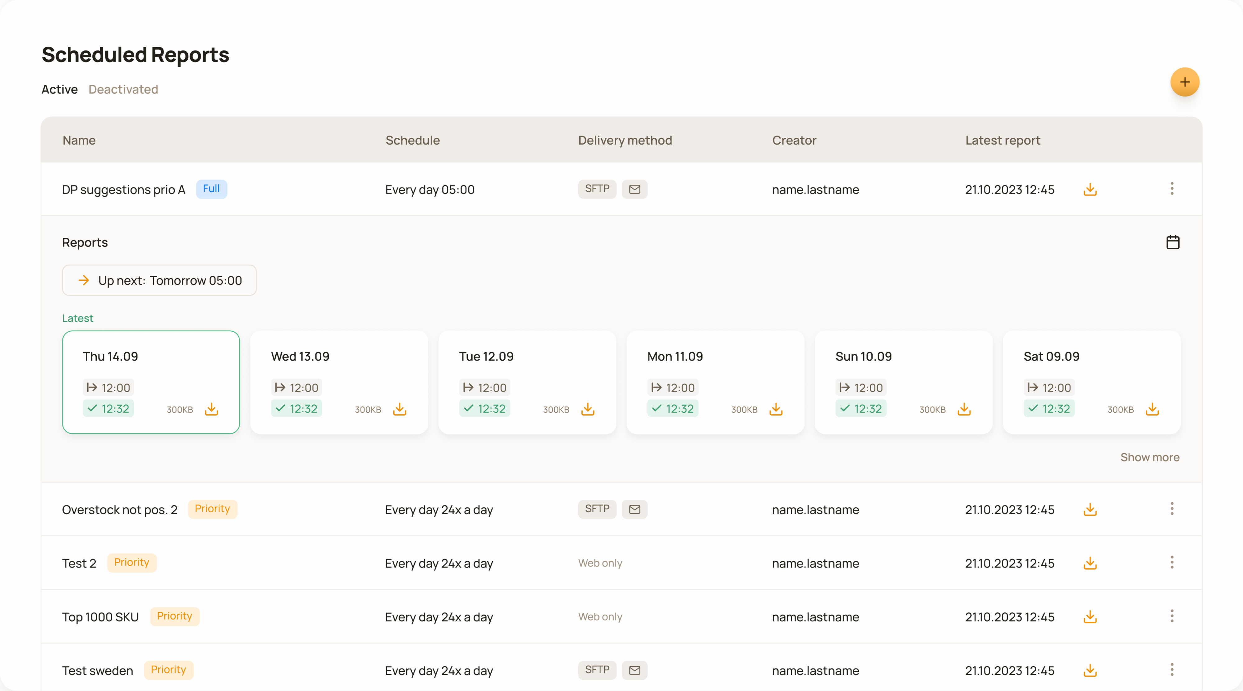
Clicking on a row opens a detailed view showing all previous reports and the schedule for the next report run.
Reports were the primary way of sharing data with customers, but fixed templates and varying customer needs meant heavy reliance on customer support for manual customization, creating a clear need for a more scalable solution.
Priceindx was founded in 2006 in Sweden and was the first company in its field in Europe. Gathering and processing large amounts of competitor data has been at the core of the service Priceindx has provided to retailers and brands ever since. Customers access this data through data presentation and data visualisation tools on the web platform.
The previous reporting system was outdated and inflexible and depended entirely on customer support. This meant a lack of autonomy and an inability to adapt reports quickly to customer needs.
Compared to other projects, the scope here was relatively clear from the beginning. We had a good understanding of the main problem both from the customers and business sides.
My goal was to understand the end-user workflows and context of use, I gathered insights primarily from customer-facing stakeholders.
To better understand the underlying problem, I gathered all available information related to reporting and its usage. I learned that customers relied on reports in their daily workflows for various operational purposes, like integrating data into their own systems for price setting, configuring campaigns, managing product assortments, and more.
Ideation started with mapping the required functionality. Since the problem had existed for a long time, the scope was relatively clear, and the focus was on documenting all the necessary details of what the tool needed to enable, which allowed us to move into conceptualisation quite quickly.
The core functionality was the ability to create automated reports, giving users full autonomy over report configuration and management.
It was clear that customer support would still retain partial responsibility for report management and handling certain edge cases. However, the solution needed to significantly reduce their workload, while at the same time giving customers more control over report management. Additionally, all scheduled reports needed to be visible in one place, where users could easily review and manage them.
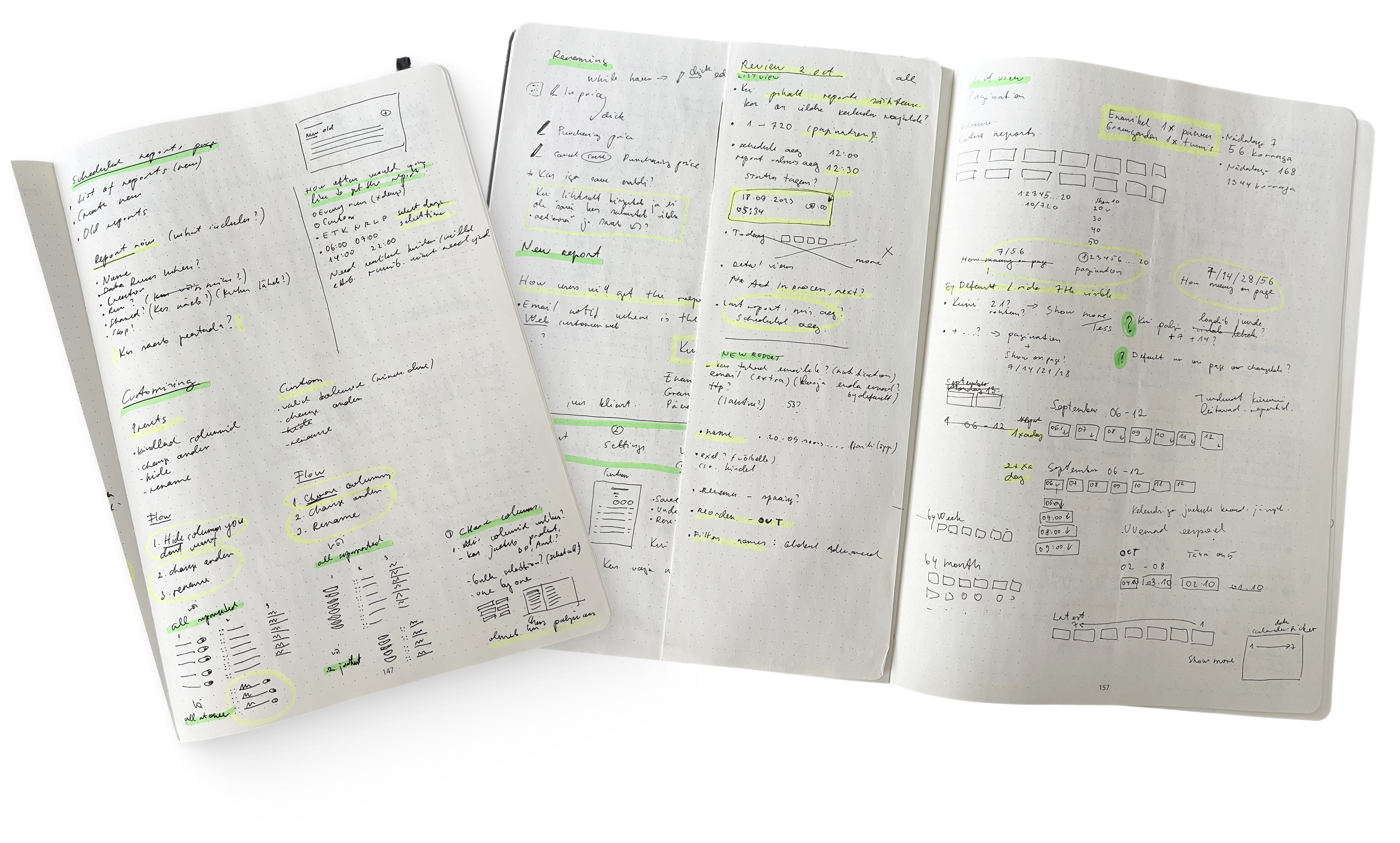
Early ideation phase, defining the requirements and functionality.
Early sketches of the reports view, when I tested different layout options for reports inside a workflow.
We built a self-service reporting tool that empowers customers to independently set up and manage their own reports, reducing their reliance on customer support.
Execution ran smoothly, with most details defined upfront and only minimal changes during the process. The primary focus was refining the user experience to create a frictionless workflow creation and management experience.
To make the report creation process easier to manage, I used a progressive disclosure approach.
Instead of presenting all configuration options at once, the interface revealed information gradually, allowing users to focus on the relevant decisions at each stage. The final flow was divided into four steps, with user input required in only two of them. This structure helped keep the process clear and digestible while still guiding people through the necessary configuration.
Wherever possible, I reused design patterns that users already knew from other parts of the product. In the “columns” step, I used the same UI pattern as in the table’s “column visibility” control, as well as the same data categorisation logic and filters.
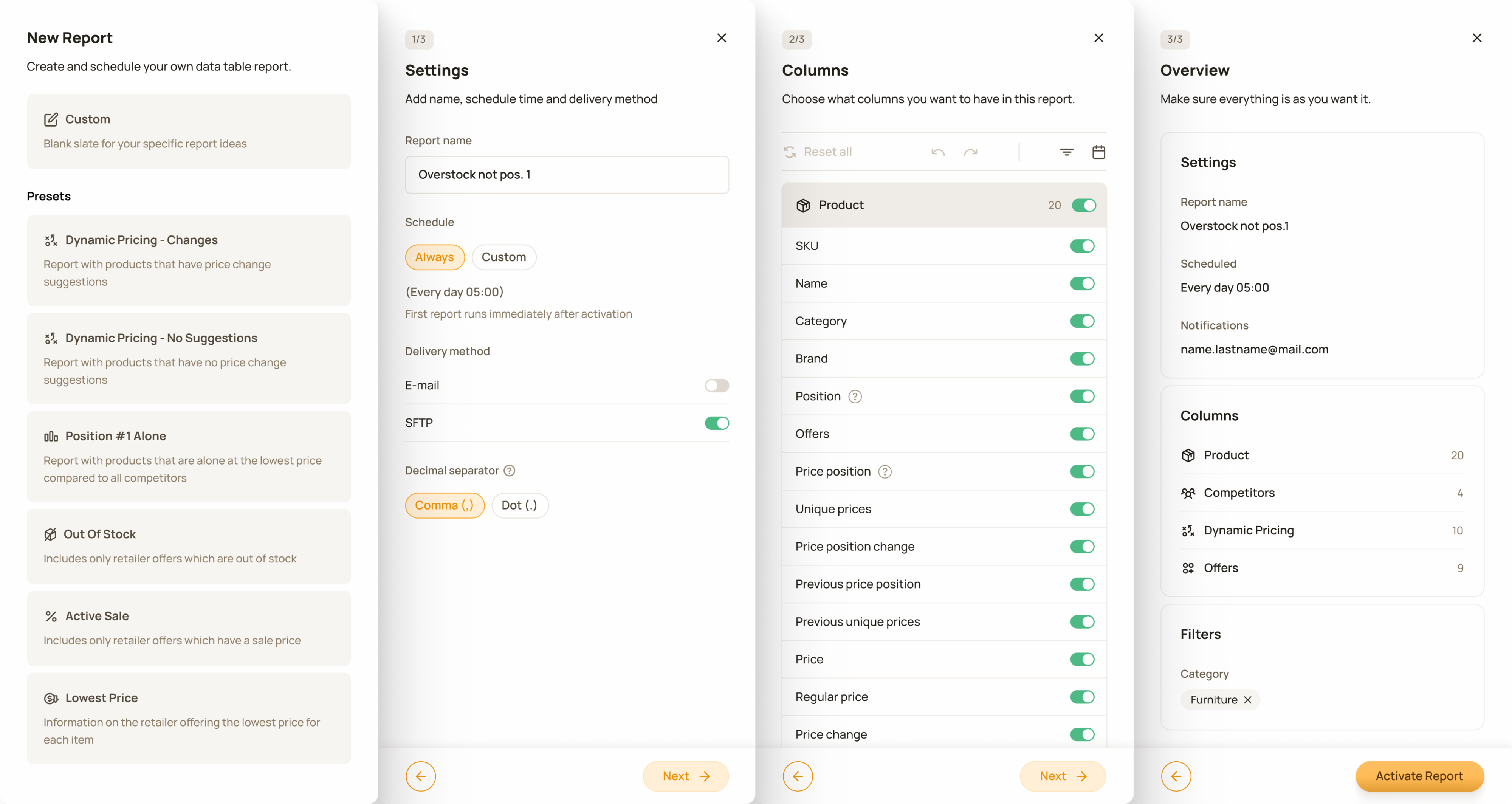
4-step new report creation flow. Using already familiar design patterns made report creation easier and faster.
Filters allow users to generate reports for specific brands, categories, or products based on selected attributes.
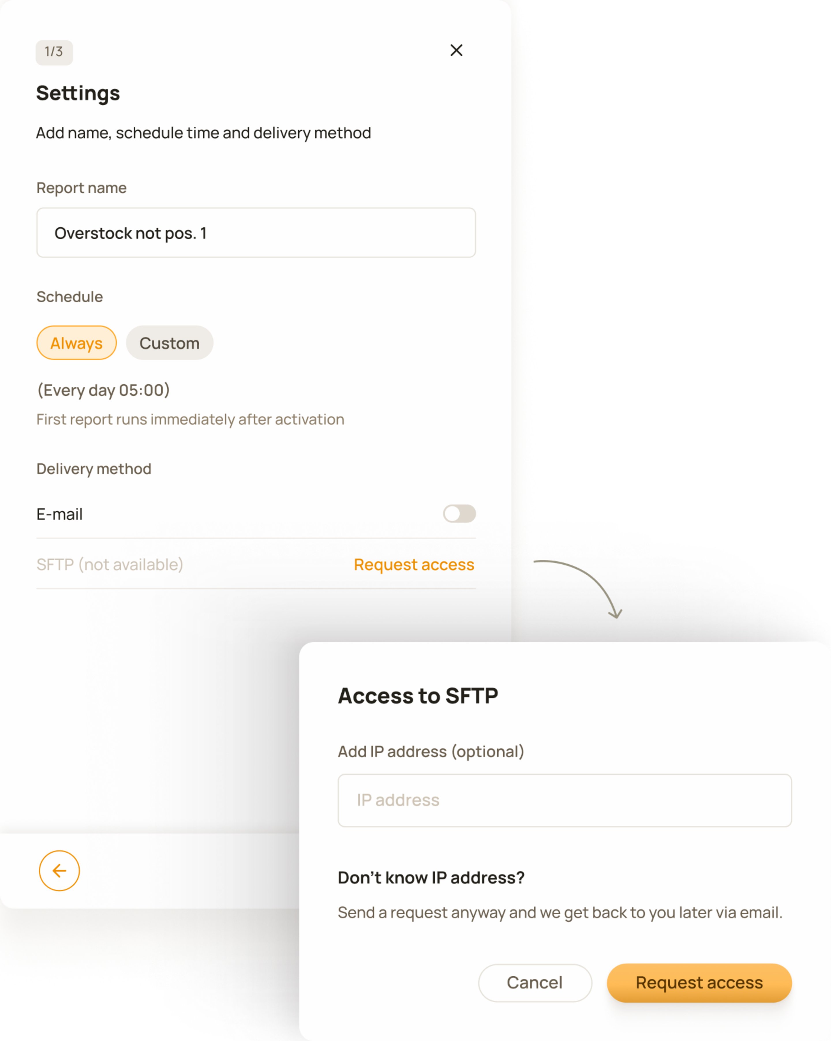
A scenario in the delivery settings where SFTP is not available and customers can request access or use other delivery methods.
Since the feature extended existing workflows and reused familiar patterns, the risk was reduced and validation was done post-launch through customer feedback and support insights, allowing improvements to be made based on real usage.
A short time after launch we made a few iterations based on customer feedback, such as configurable separator options and pin functionality in reports list view.
This project release had a strong impact on both the business and the customer. Customers now had full access to their reporting and this meant the customer support team handled way fewer reporting related tickets than before, leading to faster updates for customers.
Faster onboarding - no report configuration for new accounts
Customer Success feedback
500+
Automated reporting workflows created
Positive feedback from customers
Significant support ticket deflection in report management
Customer Support feedback
Customers: 80+. Metrics have been anonymised, rounded and presented without a time frame to protect company confidentiality.
Product Strategy Officer
Product Owner
Engineers
Designer
As the sole designer I was responsible for the full design cycle, from conceptualisation to polished UI. I was working closely with the product, customer success and engineering to shape the solution within real technical and business constraints.